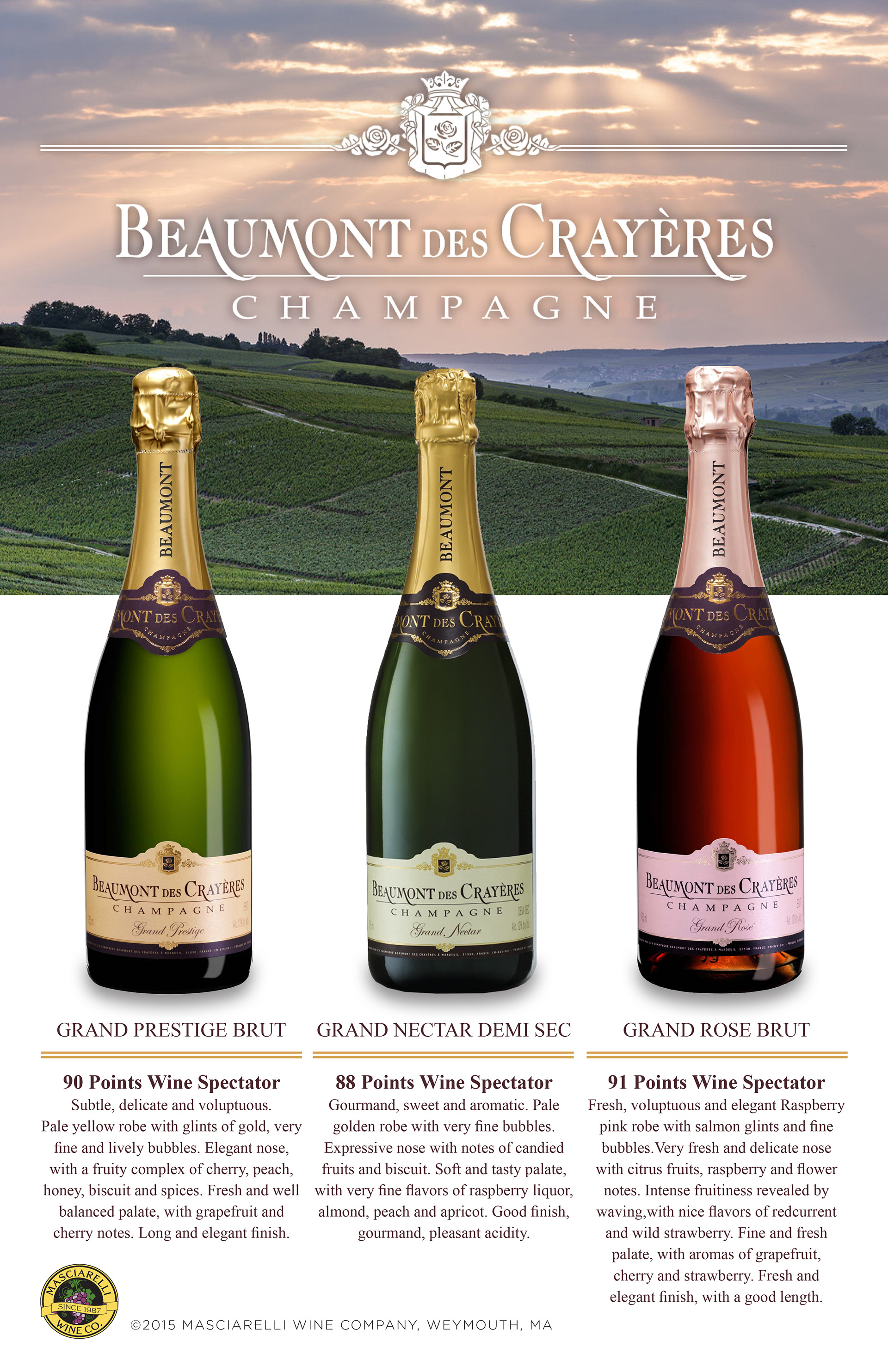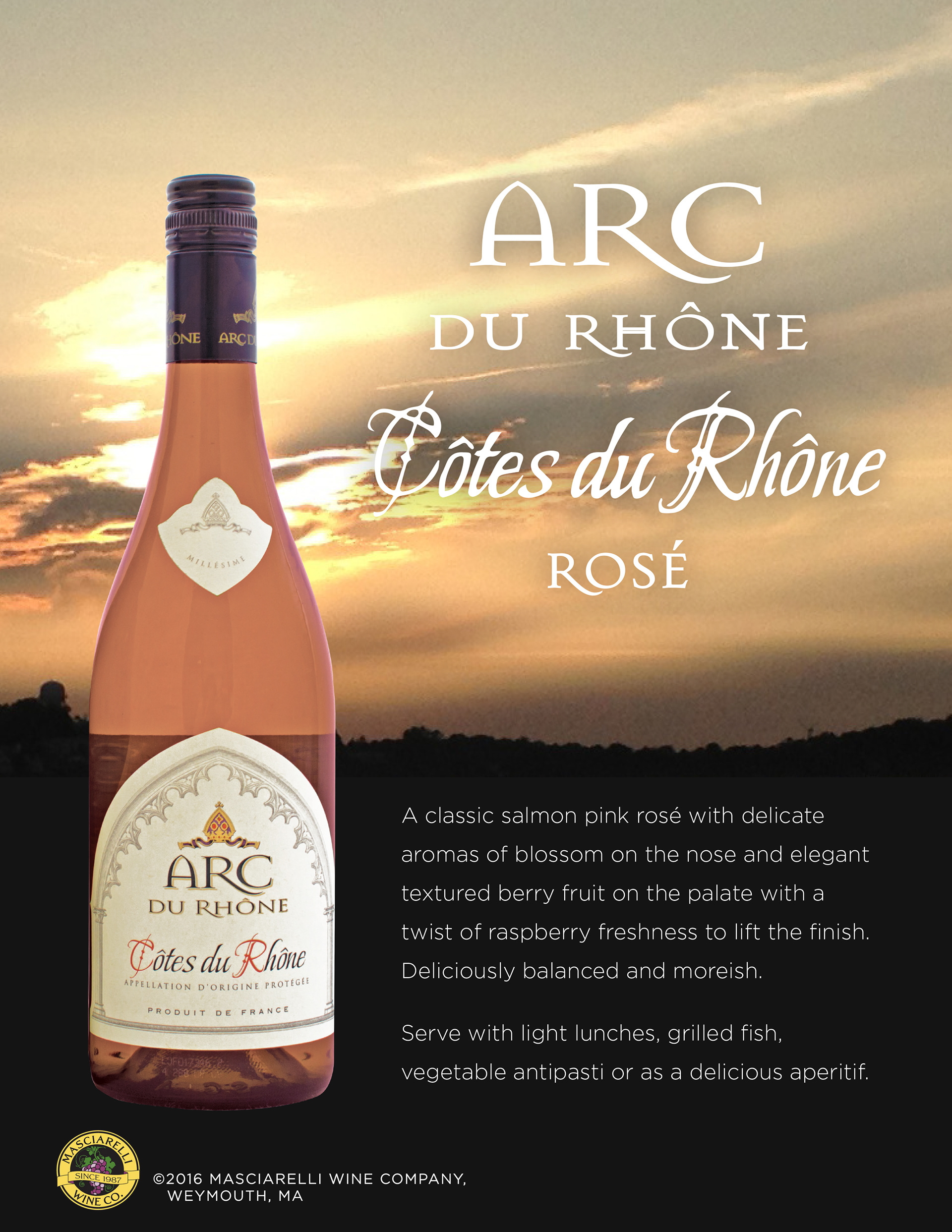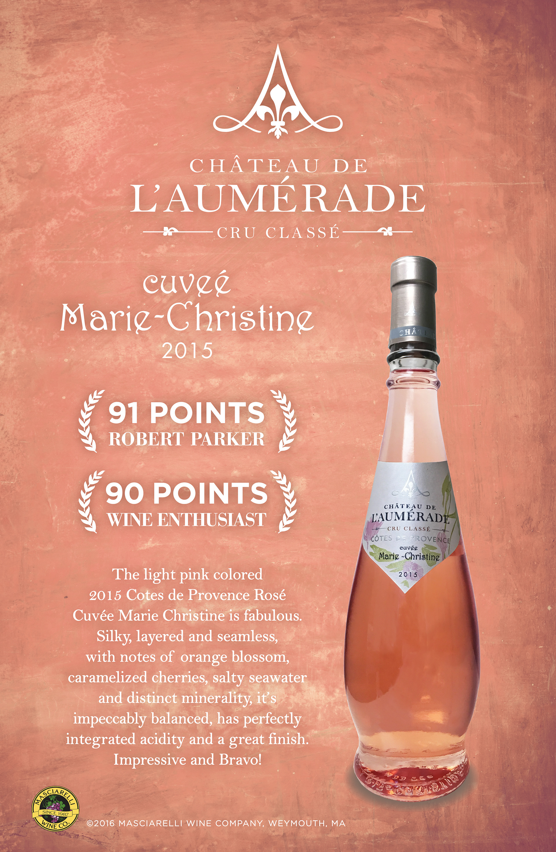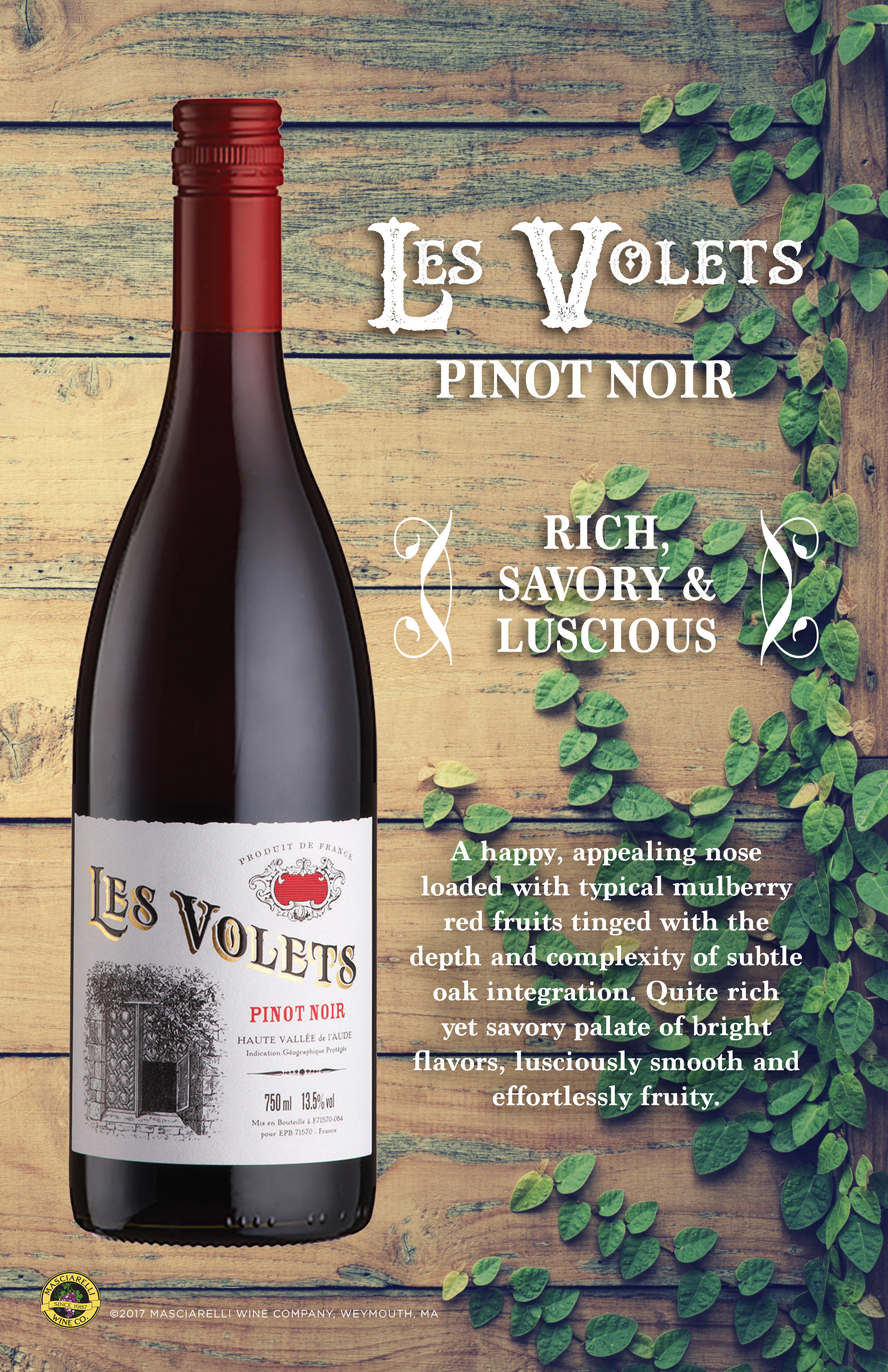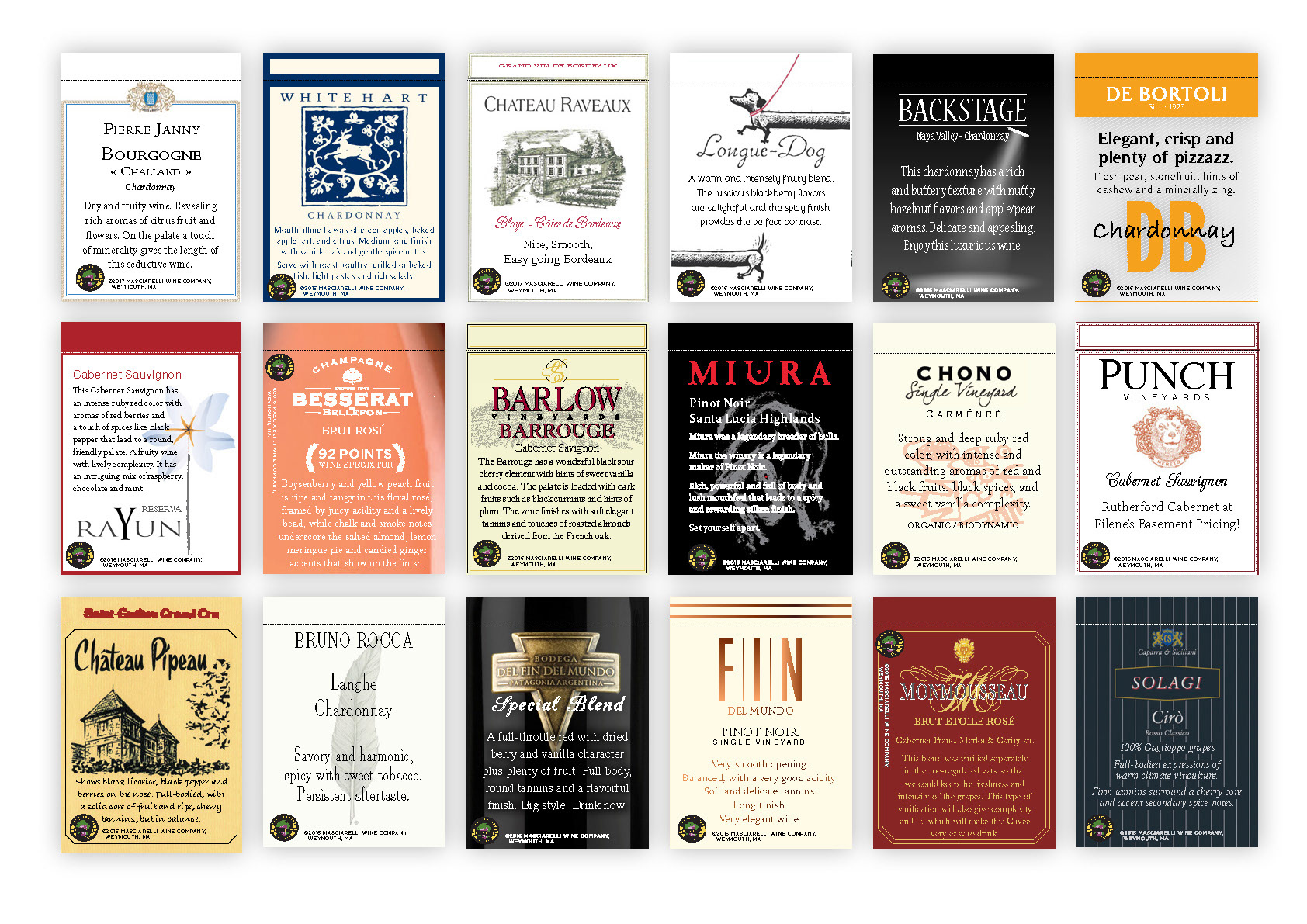
One of the most common pieces of marketing material produced were shelf talkers. These cards are displayed in package stores,on or near the wines they are advertising. The problem with most shelf talkers is that they have too much text in a print size that is too small. Space is often also wasted with an image of the wine bottle. I sought for Large clean and concise text and did away with the bottle image and instead went in the direction of using the label for inspirations
Though the these pieces went outside of the typical Masciarelli Wine Company brand standards they two had a system that kept them in line to how they would look. referring to wineries specific branding played a larger role in these pieces. Such as the producers logo and imagery as well as typefaces used in their individual brands. limitation of how much copy could be used so that the font size would not become to small and forced the copy to be brief and striking.